Saturday 26 November 2011

Yay!! Time for Glitter.

I have decided to own up. I have an addiction to glitter. I just love it. So when Christmas comes I can get out my glitter stash and use it without fear of ridicule.  Grungy Monday 28 this week is a fabulous challenge, with a super fantabulous prize, that uses some of my favorite things (raindrops on roses and whiskers on kittens. No not really.) and even better than those, metal, and embossing, and Alcohol Inks. We have been asked to take our inspiration from Tim's wonderful Altered Pumpkin which you can find here on his blog.
I did think about giving a butternut squash the treatment, but decided I would rather make some nice spiced roasted squash soup from that, so I've indulged my love for sparkly, shiny stuff and made a Christmas tag.


 I've cut a tag using from silver metal card by Paperartsy which I've embossed with a  snowflake design and then coloured with various shades of blue Alcohol Inks. I did try to make some pine cones with my new die, but need a bit more practice, so my pine cones are from a cheap deconstructed decoration I bought at Wilkinsons. I have added some Deco Ice glitter to them to make them look more sparkly.


The foliage is cut from the same die as the failed pinecones, and the tag is finished off with some shimmery, frosty looking chiffon and ribbon.

Sunday 13 November 2011

In The Blue Ridge Mountains of Virginia...

In the Blue Ridge Mountains of Virginia,
On the trail of the lonesome pine.....
I have been singing this all morning since seeing what Hels challenge over at the Sunday Stamper is this week. I think it's one of those songs that once you start thinking about it it just sticks in your head, well at least , it does in mine.  Oh no! Now I've got Ruby, Ruby, Ruby whizzing round in there as well. I'm blaming it on the fact I've just finished a week of night shifts.
Anyway enough waffle. Here's my tag.


I succumbed to temptation last week and bought the new seasonal DI's, they are truly gorgeous colours.
My tag is inked with Iced Spruce and I've then run the tag through my Big Shot with Tim's pine trees embossing folder. Then as carefully as I could I dabbed the raised bits with Evergreen Bough and Walnut Stain. Then the pine needles and cone are stamped using the same colours.
The fence is painted with Picket Fence crackle paint, and some snowy Flowersoft.  The rosette is made from tissue tape, and finished off with a couple of sparkly pins and one I made by cutting out a tiny 25 and gluing it into the memo pin with some Glossy Accents.
The tag is finished off with some ribbon and what is actually a Christmas cake decoration.
Now I've mentioned the Christmas word, I really should make a start on some cards, but actually  I just think I might watch the old Doris Day film that's on TV this afternoon, and then catch up with the first episode of the new series of The Mentalist. My conscience is clear as the garden is neat and tidy (ish), and I've been out for a longish walk this morning.

Wednesday 2 November 2011

Dulce Et Decorum Est

My first thought when I saw this weeks challenge for Grungy Monday was that I couldn't do it. My wonderful husband David passed away just over a year ago, and that memory is just still too raw and personal.
Then I got to thinking about the other people in my life that have meant so much to me, and although he died when I was only 12, I still remember my Grandfather, James Hill, as such a kind and gentle man.
Although I didn't know until many years later, his strongly held pacifist beliefs were shaped by his experiences during the First World War. James lied about his age to join the army age 15, in 1915, and along with six of his friends was sent to France, where he fought in the Battle of the Somme. He was the only one of the group who ever returned to England, and the horrors of that time never left him.
I have made this card in his memory.


Anyone who has ever driven through, or visited northern France, cannot have failed to see the huge War Graves, and I would truly encourage you to stop and visit one if you ever have the opportunity, they are immensely moving, and a strangely peaceful place to just sit and contemplate.


The words are from the poem Dulce Et Decorum Est by Wilfred Owen, whose parents were informed of his death on Armistice Day, November 11th 1918. Roughly translated the Latin means ... It is sweet and meet to die for one's country. Sweet and decorous (From Horace, Odes, III.ii.13). Please, if you can, read the whole poem. In just 28 lines it describes the obscenity and horror of armed conflict.


I have made some poppies (using my Tim Holtz Tattered Florals die), which are such a potent symbol of remembrance.  Please buy a poppy if you can for November the 11th, as young men and women are still loosing their lives in the service of our country.

Sunday 30 October 2011

Boo!

It's time for Halloween inspired designs over at The Sunday Stamper today, so using my limited supply of all things inspired by the 31st of October I've made a tag.


The tag is coloured with the new limited edition distress inks, I just love those wonderful autumn colours.  I've stamped a Happy Halloween ticket, and used a Seasonal Ideology mask for the witchy background.Using various bits of seasonal stash  and Ideology stickers I made a rosette and added the BOO. The girl is an Artchix image, and the ribbon is some seam binding stained with Black Soot DI.

Wednesday 19 October 2011

Tim in 10

My goodness, Linda has certainly set a challenging test for me this week over at Grungy Monday. We are being asked to make a card using at least one Tim Holtz product  in ten minutes or less.
The reason that this is so challenging for me is that I have a bit of an aversion to making cards as I never really seem to get them quite right, and also, I'm not very good at planning my art, it kind of evolves from a chaos of inkpads, stamps, and two extremely helpful fluffy feline advisors if I'm lucky. But I sat and thought, finally had an idea, gathered some stuff, and banished the cats from my art room/spare bedroom.

I used a black card, a manilla tag, Ripe Persimmon, Seedless Preserves, and Gathered Twigs DI's, my favorite swirly Tim stamp, some Ideology Salvage stickers and a couple of embellishments to make my card, so having set the stopwatch here is what I came up with.


Actually I wonder if I should set myself time limits sometimes, I just squeaked in at 9 minutes and 48 seconds, though what you can't see is that its not really stuck down very well!  I love those new seasonal Distress Ink colours, and mine only popped through the letterbox yesterday so it was great to use them this morning.
Now I'm off to have a look at some of the lovely artwork over at Grungy Monday.

Tuesday 11 October 2011

The Scary Sisters

I have been such a really bad blogger lately, somehow it's five weeks since I last posted anything, so the return of Grungy Monday, which is inspired by all things Tim Holtz, was perfect to kick start me into making some art.
I've made a tag which I'm can enter both in the Grungy Monday Challenge, which is all about a Holtzian Halloween, and Simon Say Stamp and Show Things With Wings.  Actually I think I can also enter this in Hel's Sunday Stamper Challenge which is Blue and Orange, as there is the teensiest amount of blue in the poison phial


The tag is coloured with a sploosh of Barn Door, Spiced Marmalade and Wild Honey Distress Ink, and the tree is one of my all-time favourite Tim stamps, stamped in Black Soot DI. The birds are stamped and embossed with black embossing powder to make them stand out a little bit, and I've tried to make my Halloween ticket look suitably grungy, on some Kraft cardstock.
The spooky sisters are an Artchix image , as is the Gothic Arch


The tag is finished off with  a tiny glass phial coloured with a poisonous looking blue Alcohol Ink, some German scrap. and some ribbon that I've dyed using Black Soot DI.

Friday 2 September 2011

Back to School

It's Anything Goes over at the Simon Says Stamp and Show blog hop and challenge this week, so in keeping with the time of year I have made a little folded pocket book to hold some vintage school type ephemera (instructions for making these can be found in Mr Tim Holtz's first ever book 'distressables', published way back in 2005).


Next I die cut a few mini tags, which are inked and stamped using only Vintage Photo and Faded Jeans Distress Inks and Tim Holtz Mini Muse Stamps, and tucked the two larger ones into a front and back pocket. The tiny tag (the all important bus ticket to get to school) and a type charm are attached to the pocket book with a mini fastener.  The ruler and times table are Ideology stickers stuck to Grungeboard and then distressed and inked again with Vintage Photo DI. Tucked into the right hand pocket is a certificate of attendance from my Crowded Attic paperstash.
I have just realized that there are quite a lot of numbers on this, so I am also entering this months Artistic Stamper Challenge which is Numbers.

Sunday 28 August 2011

Family Snapshots

Fragments strike fear into my heart, and it's because I always get into a mess with them. Too much glue, air bubbles, cat fluff caught between the fragment and the image (one of the joys of having two very helpful and artistic ragdoll cats who think fluff is the perfect embellishment for every occasion), so, with said cats banished from the room it's time to have another go.  Grungy Monday Challenge Number 21 over at  Studio L3 is all about fragments this week.  And as directed by the lovely Linda I have paid a visit to Mr Holtz's blog and his fab ideas for using Fragments which can be found there.
Here is my family tree, ( thank goodness they are not really my relatives because  Great Grandma and Auntie Joan in particular look rather scary).


I 've used a Wendy Vecchi Art Part frame which is covered with some Shabby Chic paper and inked with Antique Linen DI plus some splats in Antique Linen and Weathered Wood Distress Stains (they are such fun to do), the tree is by Wendy Vecchi and stamped in Coffee Archival Ink.  The outer frame is sanded and inked around the edges with Vintage Photo DI.  


I only had a few Fragments left , so thought I'd better avoid the etching technique until I've got more to play with as I know that I would probably melt quite a few before I got it right, so I used Alcohol Inks on Great Grandma, and somehow these are not quite right, but my technique was better by the time I got to the Family Tree fragment at the bottom of the frame.

Elsie is a packing tape transparency, how cool is that technique, I love it, it's like magic when the paper rubs away to reveal the image, her name and a little bit of spotty paper are sandwiched between the transparency and some sticky back canvas. 

The words are computer generated using an old typewriter font, and all the vintage images that I've used are from Tumblefish Studios, and,  just in case any of my family see this, none of you are quite as scary as Auntie Joan!

Monday 15 August 2011

In a Mauve Mood

It's been over two weeks since my last post,and I don't even have the excuse that I've been on holiday, but my mojo has definitely been awol.  So today I've pulled myself together and made a tag, and as luck would have it it fits in with the themes for several challenges, Simon Says Show Some BlingGrungy Monday 20 (Distress Stickles Party) celebrating all things Tim Holtz, and this weeks Sunday Stamper Challenge which must include something white.

My tag is covered with some Shabby Chic Paper and lightly inked around the edges with Dusty Concorde DI, and then using some white acrylic paint the tag is stamped with the words from the Papillon set of stamps by Tim Holtz.  The diecut dressform is card and sticky backed canvas inked with Dusty Concorde and  Walnut Stain, and again I used some acrylic paint for the stamp on the canvas (I did go over this a bit with a white pen as the paint seemed to disappear into the canvas).  And then, although you can't really see it very well I used lashings of Rock Candy Distress Stickles on the dressform.
For the bling bit of this tag I've threaded a large 'diamond' onto the ribbon around the dressform neck, and also stuck two sparkley pins into the ruffles.
The braid at the bottom of the tag is from my bag of bits, and I've dyed some seam binding with Dusty Concorde for my ribbon.

Friday 29 July 2011

Let's Fly Away...

Let's fly down to Brazil....
If only.
Over at Studio L3 this weeks Grungy Monday challenge is to Rock using Rock Candy Stickles or Distress Crackle Paint. For full details  go and have a look and also see Tims video here.
Having been given the Tim Air Travel stamps for my birthday, I felt I really needed to get them out of the packet, so here is a tag which uses them and the Travel Labels as well.

Actually, I discovered something really cool about these stamps.
The airline ticket has my birthday on it, and although it will reveal that I'm well into middle age, it's not just the day but the year as well!!

I'm afraid I just cannot seem to get a very good picture of this tag, so apologies for the out of focus effect.
The tag is coloured with Weathered Wood and Antique Linen Distress Stains, and stamped very lightly with the map of the Pacific, and then with the plane using black Archival Ink.The tag has also got a light covering of Rock Candy Distress Stickles, but it just doesn't show up. The Airline ticket was stamped on some plain white paper, inked with Antique Linen DI and scrunched up then inked again so the creases look a bit darker, and I couldn't help it, I had to circle the date. It is attached to the tag along with some film strip using tiny staples.

The hotel labels have been stamped onto manilla card using Cobalt and Vermillion Archival Ink, and then painted over with Rock Candy Distress Crackle Paint, which I hadn't used for ages and was a bit dried up, but I managed to scoop enough out to just about paint the labels. Finally the sentiment is part of the long strip of words from Tim's Stuff to Say stamps.

I'm also entering this tag in Gingersnap Creations Challenge 111 Planes and Trains, and this weeks Simon Say Stamp and Show Anything Goes.

Sunday 24 July 2011

No Lycra Allowed

You may never have asked youself what midwives do in their spare time, and in truth you probably don't want to know, but I'll let you into a secret, we do love to have fun, and it's so fabulous that where I work not only do we have a great work team, but we are all great friends as well.
At our little Birthing Centre we have started a very small and exclusive cycling club  (lycra shorts are banned), and although our stated intention is to get fit, actually the hidden agenda is that we always end up at a pub!  And these evening expeditions are always along the towpath of the Kennet and Avon canal, so its flat all the way. Well, we don't want to arrive for that refreshing drink all hot and bothered.
I was very pleased to recieve a comission from my fellow cycle club members to design a club badge, and after several prototypes here is the finished design.


I've got 10 little shrink plastic bicycles now waiting to be stuck to the badges.  Both stamps I've used are by Tim Holtz, and I've used Jet Black Archival Ink and Vintage Photo Distress Ink.  The ticket is just mounted on some stiff black card, and I've been busy with the silicone glue sticking pins to the backs of the badges.  Here is a little pile of finished ones.


I am entering my badges in the Gingersnap Challenge, On the Road, and also this weeks Sunday Stamper where the theme is Black.

Thursday 21 July 2011

It's a Cat's Life

It's been such a wet and gloomy afternoon here in Wiltshire that I thought I'd play with some nice cheerful colours, and I have made an ATC which sums up the cat life style I think my two kitties enjoy.
(Well, I hope this is how they feel!)


I've splooshed Barn Foor, Wild Honey and Spiced Marmalade Distress Inks onto watercolour paper, and used some 7 Gypsies Lille stamps with Vermillion Archival Ink, plus various bits of German Scrap as embellishment.  My Kitty's eyes and nose are made with Enamel Accents from Ranger.

The challenge theme over at The Artistic Stamper this month is Hot Hot Hot, and as these colours fit the bill, this is my entry.

If you would like this ATC just leave a comment, and I'll get my Kitties to randomly pick someone in a couple of weeks.

Tuesday 19 July 2011

This Could Be Useful

It's time for a Grungeboard Extravaganza over at Grungy Monday, the brilliant weekly challenge hosted by Linda at Studio L3 and featuring all sorts of fantastic Tim Holtz techniques and ideas.   The design team inspirations are fabulous, and if you haven't already, pop along to see Linda' lovely book and the gorgeous artwork from Brenda and Dawn.
I think it's a first for me this week in that I can't ever remember making something useful before.  Inspired by my Tim Holtz Haberdashery stamps I have made a needle book, so now I'll have no excuse for not sewing on buttons etc, because I should be able to find a needle.


I haven't used Grunge paper for ages, and had quite forgotten that really weird smell it seems to have.  Anyway, my grunge paper ends have been cut with the Scallops Alterations die, and then I have painted one side with Paperartsy Fresco Finish, Baltic Blue, and the other with Ice Blue. This paint gives a fabulous soft chalky finish that I just love.  The edges are coloured with a little Vintage Photo Distress Ink.


Some ric rac is just adding a bit of decoration inside the back cover.  The pages are made from from some scraps of natural linen, as is the cover, which I have stamped with Coffee Archival Ink, and then stitched to some paper. I have added three buttons as an embellishment, and then after sewing my book together, have glued this to the front cover.  I have stamped the pages with various sewing motifs. but they don't seem to show up very well in photos.
Now I'm going on a needle hunt to fill up my new needle book.

Tuesday 12 July 2011

A Bit Rusty

It's already Grungy Monday Number 15, and I am still hopelessly behind, but thought I'd just dive right in with this weeks challenge, full details of which may be found over at the lovely Linda's blog Studio L3.  Here you can see fabulous examples made by Linda and the two Guest Designers for this week, Barbara and Rinda.
The technique this week is from one of Tim's 12 Tags of Christmas 2007, and full instructions can be found over at his blog
It's all about making a rusty effect this week.
I am one of those people who don't read instructions right through to the end before I start something (anything from Ikea always has not enough of something, or stuff left over at the end when I think my new bookshelf is done only to find it's actually the thing that holds it all together that I still have left).  I truly wish I had read the instructions to the end, because I had a lot of embossing powder flying around in a very messy way as I made my tag.
The tag is coloured with Wild Honey and Vintage Photo DI's, and I've used a Tim Holtz stamp for the words and the delivery van is a Wendy Vecchi stamp.
Now I need to have another go at cleaning up the dreaded embossing powder, because although I thought it was all gone it seems to keep appearing all over my desk as if by magic.

Friday 1 July 2011

I Do Like to be Beside the Seaside

I had a lovely day out in Swanage yesterday, which is such a traditional seaside resort, with a great sandy beach, and deck chairs for hire, plus lovely ice creams to buy. So there we were wrapped up well to protect us from the chilly breeze, getting sun burnt faces, and having a jolly good time, and fish and chips for lunch. (Sometimes you just have to ignore the fact you are on a diet!). It was too cold to swim, but my toes turned blue as I went for a paddle.
So today I've made a sea themed little triptych.  As it has stamping, words, and uses packaging materials, 


The centre panel is made on watercolour paper sploshed with Broken China and Peeled Paint Distress Inks, and stamped with a Paper Artsy stamp in the same colours, plus a mini postcard by Stampers Anonymous.  I used bubble wrap lightly dabbed with gold acrylic paint to finish the background.  All the collage images are from Artchix.


The side panels are made from some corrugated card that was wrapping up some books from Amazon.  I've peeled some of the top layer of paper away randomly, and painted with some pale turquoise acrylic paint that is a mixture of several colours, a tiny bit of light green, and then dry brushed with a tiny bit of gold paint.. The inchies and bottoms of each panel are edged with German scrap


The triptych is finished of with some gold paint  and a jade Coloursoft crayon around the edges, some sea coloured fibres and a little bit of pearly bling.

Wednesday 29 June 2011

Anyone for Cocoa?

It's already Week 13 of Grungy Monday which celebrates all things Tim Holtz,over at Studio L3, hosted by the lovely Linda Ledbetter.  This week it's time to get the Alcohol Inks out, and pay a visit to Ranger Ink to see Tim's How-To video. There is some fabulous inspiration from Linda and the two guest designers this week, Celina, and Suzanne, so please go and check out their blogs.
I'm not really given to making cards, but thought I'd have a go, just for a change.
I've used Butterscotch, Red Pepper, Lettuce and Gold  Alcohol Inks for my background, and the stamped images are Artistic Outpost stamps. The cocoa coloured paper is from my Lost and Found paperstack, and I've kept it really simple with some twine a button and some tiny fasteners to finish off.

Sunday 26 June 2011

Where's my Grungepaper?

Haven't used those Wendy Vecchi stamps for a long time, so it's about time they came out of the box that they have been lurking in for about the last six months.  I just love all the wonderful things that Wendy makes, they are so inspiring.
 I thought I'd make a simple tag, and as the theme for Sunday Stampers this week is Words, it will be my entry over at Hel's brilliant blog.

The tag is inked in Antique Linen and Vintage Photo, then sploshed with water, then stamped with stitches from the Just Sew Artsy stamps. I was going to stamp the leaves on Grungepaper, but it's hiding somewhere so I spent a laborious ten minutes cutting them out from card, which I only managed to tear once and have cunningly concealed!
The heart is coloured with Barn Door DI, and the lace trim is also a Wendy stamp.
I then used my new (birthday pressie to self) die to cut out the bookplate, which is painted with gold acrylic paint and aged a bit with Espresso acrylic. The words are from Tim's Odds and Ends stamp.
The flower is yet another Wendy Vecchi stamp (Art in Bloom), and I'm so sad the button in the middle doesn't show up very well, because it is gorgeous, with a lovely sparkly middle

Tuesday 21 June 2011

A Bit of Resistance

It's great to have been on holiday, but it's really nice to be at home and on a very wet and windy midsummer day I have the perfect excuse to stay in and play with ink and paint. I've used some of my favorite Artistic Outpost stamps to make this tag, and the technique is one which can be found over at Tim Holtz's fabulous blog, which is always full of lovely stuff to look at. 


It seems like ages since I've joined in with Grungy Monday, and I can't believe that we are already on number 12, but as it's only Tuesday today, maybe I can catch up with a few of the challenges I've missed during the next week.  Go and have a look at the beautiful design team pieces by Alison, Linda, and Linda over at Studio L3.


This week Simon Says Stamp and Show Some Metal, so it's two for one with this tag, though why do I always feel like I should really make two completely different things? 
Anyway, I must now go out in the rain and rescue my Sweet Peas, which have not only got seriously beaten up by the rain, but some of the canes have now pulled out of the ground in the stormy weather. 

Sunday 19 June 2011

Back from my Holidays

I have just come back from my holidays, and what an action packed and fabulous time I had. It had always been a dream to see the Grand Canyon, and now I have. Awesome is an over used word, but it truly is. I had not in my wildest dreams imagined how vast and impressive it is.  However, the trip just got better and better,as I think I actually felt closer to the amazing wonder of the natural world in both Bryce, and Zion Canyon. And here is a picture of me at Inspiration Point, Bryce Canyon, to prove I've been!


And to round off a fabulous break from everyday life, when I got home I had a weekend of arty fun to look forward to with the lovely, and very talented Sioux Jenney and Laura Liddle.  This was something we planned after having so much fun at the Tim Holtz workshop in Febuary,  and what a great time we have had. Lots of ink, very stick UTEE, beeswax and learning some fabulous new techniques. PLUS we have drunk a teensy weensy bit of Cava, which seems to be a marvelous aid to creativity.
Our theme for the day was to alter an Ikea Mirror frame, and we all had very different ideas  that we wanted to try out.
Always a bit a bit of a think of something at the last minute person, I finally decided to use the colours I'd seen on my holidays as a point to start from.  I think my visit to Inspiration Point may have recharged my mojo which had been on it's own little holiday for a week or two .

  
Quite a few techniques going on, with lots of Tim Holtz goodies, plus some of those lovely Graphic 45 papers, and I was quite pleased with the way the butterflies turned out dipped into UTEE. Here are a few more close up images of the different elements.


I had such fun making this frame, and learnt so much from Sioux and Laura, what a fabulous way to spend a rather damp Saturday.  And now I'm going to take a quick trip around blogland to look at some of the fab art I know I've missed over the past few weeks.

Monday 23 May 2011

Renaissance Man

It's another Grungy Monday, hosted by the lovely Linda over at Studio L3, and  it's so exciting to be one of this weeks guest designers. I've had a real blast with this weeks fab watercolour technique which you can find full details of over at Tim's wonderful blog, which I've taken to randomly dipping into, because where ever you end up there is always something really good to look at, or to try out. 
Go and check out the fabulous art that Linda creates, and also please drop by my fellow Guest Designer Ellen's brilliant blog which is full of amazing art. Then don't forget to visit the All Things Tim  discussion Group at Yahoo where there is a Grungy Monday file full of fab artwork as well.

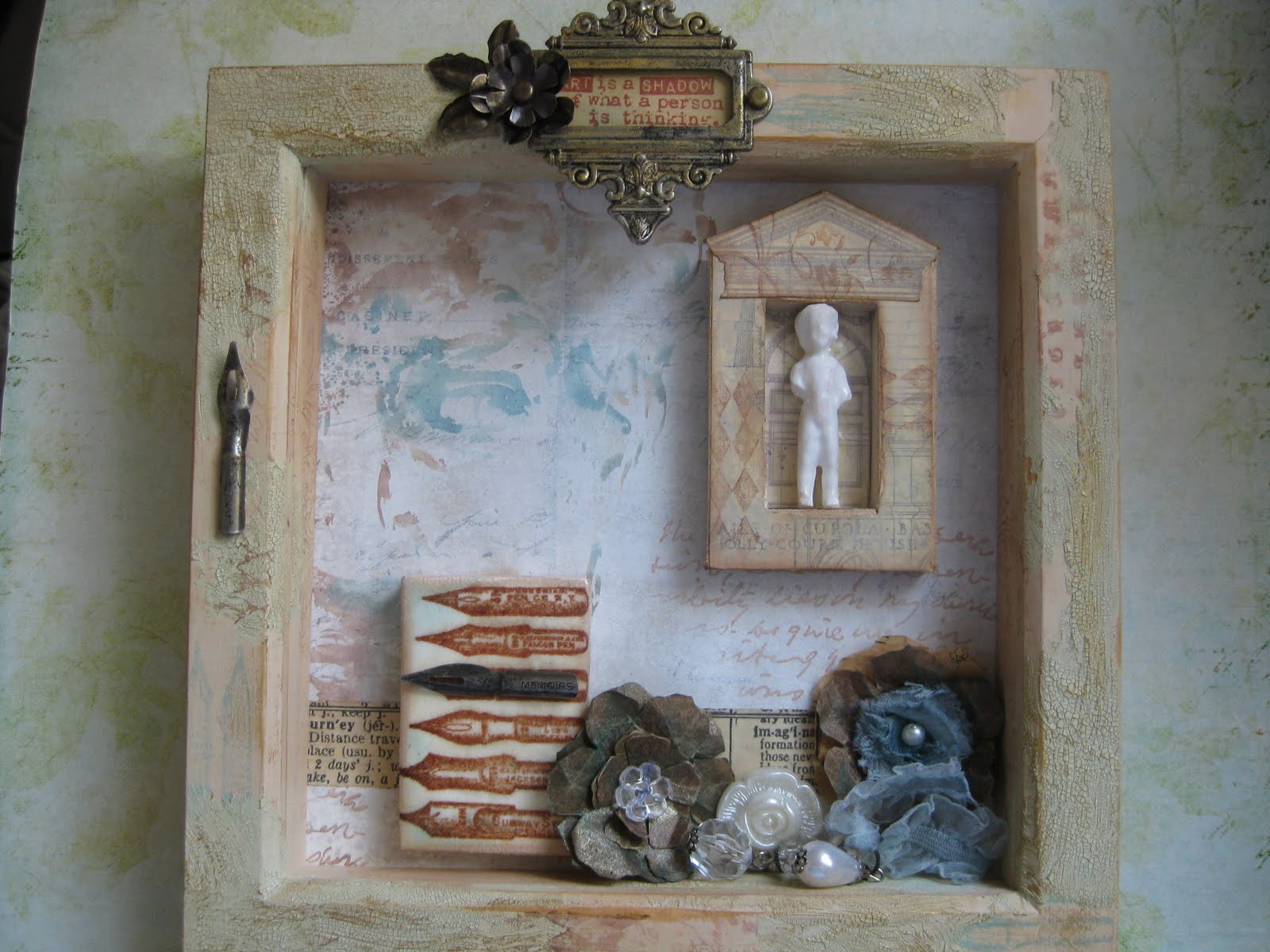
I had a bit of a dilema with this technique. Should I go bold and vibrant, or use a more subtle colour scheme. At heart I'm a grungy girl, so I finally decided to go with, as you can see, a fairly subdued range of colours.  I think I'm aiming for a faded Italian Renaissance look here.


The background  is made using paper from the Crowded Attic Paper Stack, which I've painted with some watered down Snowflake Paper Artsy Fresco Finish Chalk Acrylic paint. This gives a matte finish which is just wonderful to stamp on. I have used distress inks (Vintage Photo and Broken China) for my watercolour technique stamping, rather than the Adirondack Inks that Tim uses on his blog, and they work really well but give a softer, more translucent effect. The image of David is from one of my favorite Tim stamp sets, Artful Artifacts, and the script is a from a PaperArtsy Hot Pick stamp set.
The flowers are made using the Tattered Florals die and some Kraft Glassine paper, which I scrunched up and sprayed with Blue Smoke Perfect Pearls Mist. I also used this to spray the Trimming in the centre of the right hand flower and attached to the Baubles.  Behind these I've used some Tissue Tape, and after a bit of fiddling about managed to get the words I wanted in just the right places.


I've used two mini canvases, the top one I've used back to front and covered with the Architechtural blueprint paper from the Crowded Attic Paperstack. It made a perfect little niche for the small Fractured Doll, who I thought looked a bit like a minature of Michelangelo's statue of David, although for modesty's sake some bits are missing.  To give the frame of this mini canvas more depth and texture I have used the little diamonds stamp from Tim's Mini Muse set, and the floral spray from Artful Flight. 


For the second mini canvas I stamped the pens from the Artful Artifacts set on to tissue paper with coffee Archival Ink, and then used beeswax to fix to the canvas.  To get a nice sheen  to the wax I have just buffed it with the side of my hand, and then finished off by adding an Ideology pen nib.  I have a real problem getting my camera to get this bit into focus, and this seems to be about the best it can do, it's the least fuzzy option.

My frame is a cheapy from Wilkinson's that has been painted with Claudine Hellmuth Studio paint in Traditional Tan, randomly stamped with some of the same images I've already used , and then distressed  with a bit of hammering and some Old Paper  Distress Crackle Paint, which has been inked over with Vintage Photo Distress Ink to get into the cracks. Then I just couldn't resist using a little bit more Ideology goodness to finish off.
I've had a great time making this project and love this technique, so in the interests of art and science I am going to try it with as many different types of ink as I can find in my stash. So far, some have worked better than others, and I'm finding inks that I can't even remember buying!
PS I'm just writing this Wednesday 07.00.  Blogger is doing something really wierd and I am continually logged out of my account each time I try to leave comments on some blogs. (Apparently it's a known issue that they are trying to do something about).  Until they get it fixed I can only look at all the beautiful artwork at Grungy Monday this week.

Tuesday 26 April 2011

Time is Flying

I've have had a close encounter with the NHS over the weekend as a patient, and spent Easter being pumped full of antibiotics as somehow I had managed to get pneumonia, so no Easter eggs for me! I must usually be a pretty healthy person as I've reached my fifth decade and never been ill enough to have to go to hospital before. Anyway now I'm home and feeling heaps better, so thought I would have a little time with my ink and stuff.
This wall hanging is my entry for Grungy Monday No.5 at Studio L3. The challenge this week is A New Dimension, and the full details of what to do can be found over at Tim's Blog as the May 2008 Challenge. It also fits in with the Sunday Stamper theme this week which is wings, and as there is a solitary button, I think I'll make a three for one and also enter it in Simon Says Stamp and Show Some Buttons.


This was a neat technique, and not one I'd discovered before on Tim's Blog. I've used the new Papillon stamp, a Wendy Vecchi Art Parts watch, and some Crowded Attic paper, Coffee Archival Ink, and Broken China Distress Stain, plus some bits of Ideology. The wings are made from the new Kraft Glassine paper, with some gold leaf flakes. ( They remind me of a moth I've seen somewhere, probably in a book, as in real life I am rather a wimp about the way they flutter round, and don't really like them much, certainly not enough to get a close up look at their wings).

Monday 18 April 2011

Something Different.

Last week I started the most amazing on-line mixed media art workshop (She Art, run by the extremely talented Christy Tomlinson). I am having so much fun!!! I love to try new stuff, and this is so different from anything I've ever tried before.
Christy makes the most amazing art, and I was really drawn to the fabulous mixed media techniques she uses on her canvases, but I have to say I really had fun making my first girl as well, and here she is.


I've used old sewing patterns, acrylics, modelling paste, colour sprays and stamps on my background. It was a truly messy experience, but I certainly enjoyed myself, and can't wait to get started on the project for week two.

Tuesday 12 April 2011

There's More Than Fish in the Sea

Grungy Mondays are coming round really fast, but what a great challenge the lovely Linda at Studio L3 has lined up for us again this week, Exploring Tim Holtz Adirondack Color Wash.
Now I have to admit that I have a very limited collection of these, ie. TWO!!, but I think I must get a few more because the colour is just so intense, it was actually a bit scary at first. My tag has been sploshed in a puddle of Sailboat Blue Color Wash and then sprayed with water and allowed to drip. I have cheated a bit as there is also some Antique Linen Distress Stain in there too. The tag is edged with a Gold Acrylic Paint Dabber.

The stamp I've used is the Tim Holtz Haberdashery one, using the pattern stamp for the background with Broken China DI, plus my favorite flourishes in Vintage Photo.
The dress form is stamped with Coffee Archival Ink, and the trims are coloured with Broken China DI's.I will be honest and own up to the tissue tape covering a wonky bit of stamping, but I quite like it anyway.The tag is finished off with some Ideology.

Here's a tag I made yesterday also using the color washes (both of them this time)and a different approach in that it is much more vibrant, as well as using a ridiculous amount of German Scrap, which seems to be something I can't resist buying and then rarely use. I know I posted a tag featuring flying kitties a few months ago, so going off on another little fantasy trip I thought why not Mercats. (No not meercats like Alexander, but ones that swim in the sea).
I made her fishy tail by sticking overlapping layers of scrap to double sided tape and then cutting out. The kitty is an Artchix image, and as you can see I have tried to preserve her modesty.
There's a lot of blue going on this week so as well as Grungy Monday, I'm also entering these tags in the Sunday Stamper Challenge for this week which happily is Blue.

Tuesday 5 April 2011

Fly Away

I can't believe a whole week has gone by since I last got inky fingers, but due to being called out five times in three nights plus working normal hours during the day, I have been in my own little twilight zone for the past week. I missed the first Grungy Monday (Sob!!! Sob!!!) but what wonderful art work can be seen over at the lovely Linda's Studio L3. This fab challenge is inspired by the work and products of the King of all things Grunge, the wonderful Tim Holtz . This weeks challenge involves a field trip to Ranger Ink to view one of Tims demo's, which shows a great way to use Distress Inks with Multi Medium.

Anyway, enough waffle, here is a tag that I am entering in this Grungy Monday No 2, Simon Says Stamp and Show Anything Except a Card, The Artistic Stamper monthly challenge, which is Layers, and this weeks Sunday Stamper, the theme of which is Gold.

The young lady peeping through the keyhole is off to Ms Francine's Prep School for the Arts, but in her dreams will be appearing at Covent Garden before too long(watch out Renee Fleming!).
My songstress has aspirations to sing like the bird at the top of the tag.
I've used Distress Inks in Faded Jeans and Vintage Photo for my background, tissue tape to cover my bird, an Ideology keyhole and a flower from a box of unidentifiable stash. The flourish is cut from Grunge paper, and inked with Vintage Photo, and lightly brushed with Inka Gold.

Monday 28 March 2011

The Three Boffins

A bit like the Three Musketeers, but more brainy!! This shadow box uses loads of Tim Holtz goodies. I've been pondering over the Steampunk stamp (bought it and then just didn't quite know what to do with it) for a couple of weeks. I'm entering this in Simon Says Stamp and Show a Hat, the new challenge for this week.
The frame is Shabby Vintage paper, inked with Black Soot DI and then using the blueprint stamp embossed in black. I then sanded away bits of the paper to create a more distressed look and glued to the frame.
The boffins are stamped onto grunge paper, and I then stamped the hats again, and covered these with Glossy Accents to give a more dimensional, shiny effect. The background is manilla cardstock, inked with Wild Honey, Barn Door and Aged Mahogany DI's, which I've then stamped with Vintage Photo DI and then added Copper Perfect Pearls to try and maintain the industrial look. The box is finished off with various bits and pieces of Ideology.

Wednesday 23 March 2011

Spring is in the air

After several days of complete lack of inspiration and anything that I felt remotely happy to put on my blog I have spent the past hour!!! revamping my blog slightly, with a new header and background.
After fiddling around with bloggy things I thought I'd try out some of Wendy Vecchi's Clearly for Art. I REALLY like this stuff, especially the way you can stick paper to it and then heat and shape. Mind you the fumes are absolutely horrible. So here is a little wall hanging made with Art Parts, the above mentioned bendy stuff, some Seasonal Paper Stash, and a die cut flourish, made using my trusty Big Shot. I keep looking at pictures of that lovely Vagabond. I have to keep telling myself I really don't need one (but I think I really do).


I'm entering this in the Sunday Stamper Challenge which this week is Dies, and this weeks Simon Says Stamp and Show a Word. The floral theme is because it feels like Spring is really here today, it's been a beautiful sunny, and warm day, and the daffodils looks so cheerful in my garden. I've used one of my favorite colour combinations of eggshell blue and brown, and the stamps used on the frame and the flowers are all Studio 490.
Now I'm going to have a little wander around blogland looking at all the lovely stuff out there.

Monday 14 March 2011

Star Quality

Simon Says Stamp and Show Stars this week, and I thought about starry skies, but then I just knew I had to make something featuring two of the greatest music makers ever. I absolutely adore Ella Fitzgerald and Louis Armstrong singing Dream a Little Dream. And it provides a double dose of stars, not only in those fabulous musicians, but also in the lovely lyrics.

The tag background is the lyrics of the song, lightly inked with DI's (hope I haven't broken any copyright laws here, but the lyrics seemed to be freely available on the internet). The stamp at the bottom is from Graphic 45, the words are computer generated, and the pictures are from a CD insert that I've sacrificed . I've used some tissue tape and a little bit of Ideology to finish my tag.

This song always brings back such happy memories for me, as before David became ill we spent many happy times sailing in Greece, and would often moor up for the night in a quiet little bay with only the fish for company. No TV, no radio (except The Archers on the World Service!).
After a bottle of wine with dinner, and if no other boats were within earshot, we would enjoy singing along with Ella and Louis, and actually could do quite a passable version of our own.

Now I'm going to do a first for me and try to link in a YouTube video of this lovely song.


Hope you like it, it's from a great series of shorts the BBC did a few years ago.